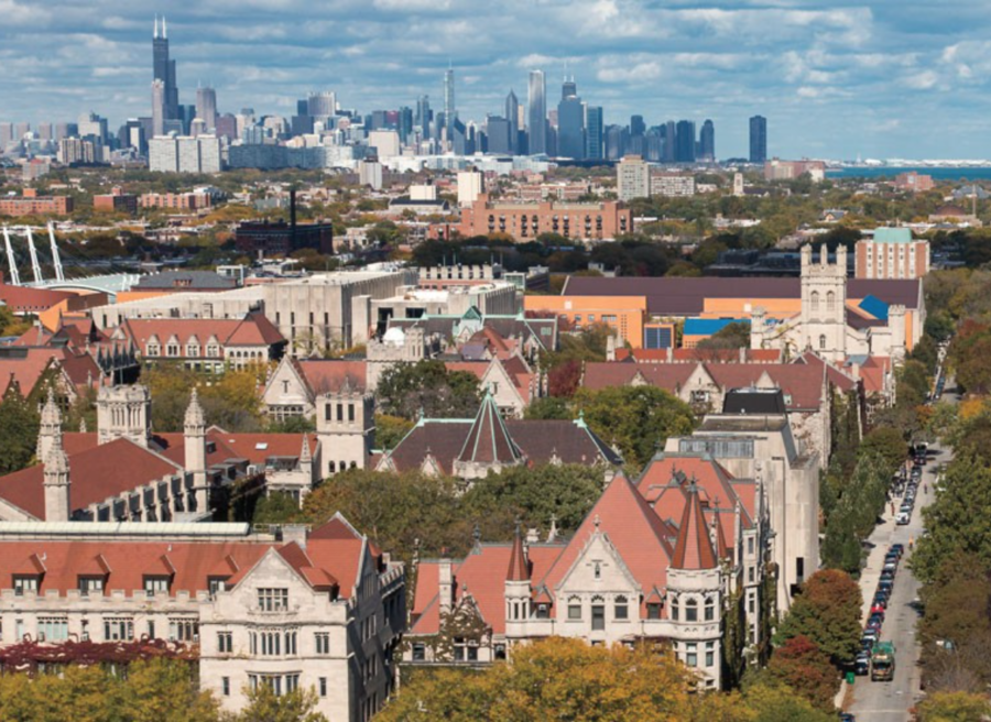
The other night, one of my roommates recalled her first time seeing campus. Her introduction was a photograph of the University’s gothic architecture and brick-red roofs laid out, it seemed, just in front of the modern glass and concrete spires of downtown Chicago. This photograph has become the face of UChicago marketing to prospective students; it appears in mass email communications, on brochures, and as the first image on the Visit UChicago website. Yet this photograph misleads prospective students and fails to acknowledge that the University exists not in downtown Chicago but in Hyde Park—one of the most crucial parts of the UChicago experience. When advertising UChicago to prospective students, the University should take a more all-encompassing approach, replacing this overused photograph with one that displays the University as it truly is.
The photograph seamlessly removes the distance between downtown Chicago and the University, making it appear as if a brief jaunt down Ellis would end in the Loop. In reality though, accessing downtown is no walk in the park. It often takes an hour via CTA, anywhere from 20–45 minutes using expensive rideshare applications such as Uber and Lyft, and around two hours on foot. This photograph misleads prospective students into thinking that the trip to get downtown is quick and easy. While classes are in session, I have found that going downtown during the week is a pipe dream, and it is even rare to do so on weekends. Since the majority of my Saturdays are spent at track competitions, I often find that I have only a few hours of absolute free time. Given the cumulative transport time to go downtown and return can reach two hours, I prefer to allocate my free time to an activity such as cooking, rather than sitting in a train, bus, or car. Although some of my friends visit downtown regularly, the majority stay close to the University. To not mislead prospective students, UChicago should use photographs that reveal the true distance to downtown, especially given that 53rd Street has a vastly different atmosphere than State Street.
The photograph compresses everything that is neither campus nor downtown into nearly nothing. By diminishing the amount of space Hyde Park physically occupies within these introductory photographs, the administration sends the message that Hyde Park is of little importance to the University, which is the exact opposite of the truth. Hyde Park is an integral part of a University of Chicago education, far more so than downtown is. For instance, even though I’ve always found teaching a desirable profession, living in Hyde Park has made me realize that I want to focus on teaching in underserved communities. The framing of this photograph, and other promotional materials like it, diminish the importance of the residents, culture, and atmosphere of Hyde Park. These are the things that the University should embrace and highlight, for they are what will be part of students’ everyday life. Although their beauty is not the same as the beauty of the sparkling lights and elegance of downtown Chicago, they are responsible for the dynamics of the college experience at UChicago and must be made known to students who choose to apply. Presenting prospective students with a photograph of the University in the context of Hyde Park rather than of downtown would be a more honest representation of the school. This could be a small yet significant step in fostering more open mindsets and helping incoming students better understand their new community.
Just as others have acknowledged, creating more open dialogue between the University and Hyde Park has to start within the University’s own campus. Even a subtle recognition of the influence Hyde Park has on the University by taking new photographs to present UChicago to prospective students has the capacity to create a more integrative community in years to come.
Maya Ordonez is a third-year in the College.


