The first thing I saw upon entering the Bertrand Goldberg exhibit at the Art Institute was a curved, faux-wooden wall with the name of the show, Architecture of Invention, written on it in thick lettering. This seems like an oddly unremarkable choice for an architect who spent his life experimenting with idiosyncratic design. However, behind the fake wall, an extensive collection of photographs, models, blueprints, and more of Goldberg’s work is presented in all its unconventional glory.
The exhibit works best when it combines several different media in a single structure. For example, the first thing I noticed in the section that shows Goldberg’s work on hospitals was a black and white photo of the Good Samaritan Hospital in Phoenix. The building appears ominous and slightly menacing, and reminded me vaguely of the Tower of Mordor. The picture was taken from an angle that looks up at the tall structure, and the top of the building is immersed in thick, black clouds. The double rows of oval windows that run up all sides of the hospital are made eerie by curtains that are either closed or only slightly parted. It didn’t look like the kind of place I’d want to go to get my tonsils removed.
But then I turned to the models, and the squat recreations looked much friendlier and more inviting than the photograph did. They’re simple: Gray, with oscillating corners and those same oval windows that now just looked cute. Still, they struck me as a bit unusual considering the standard image of hospitals as plain, rectangular, purely utilitarian designs. I dismissed this as artistic flair before the blueprints convinced me otherwise.
Before I entered the exhibit, I was not excited about seeing the blueprints. I have little interest in architecture, so looking at detailed building plans seemed painfully boring. But in this exhibit, the blueprints helped inform and enhance the other media of Goldberg’s work. For the Good Samaritan Hospital, I saw that the oscillating design was not conceived for its aesthetic merit, but stemmed from Goldberg’s interest in incorporating circular sections as community boundaries into his buildings. The plans showed that one of the oscillations was meant to house a nurse’s station in the center, with patient rooms fanning out from it. The effect of this was that each patient would be equidistant from his or her primary medical care, as well as creating a small, clearly designated wing for each group of rooms. Other parts of the hospital, like the surgical suite, were designed similarly.
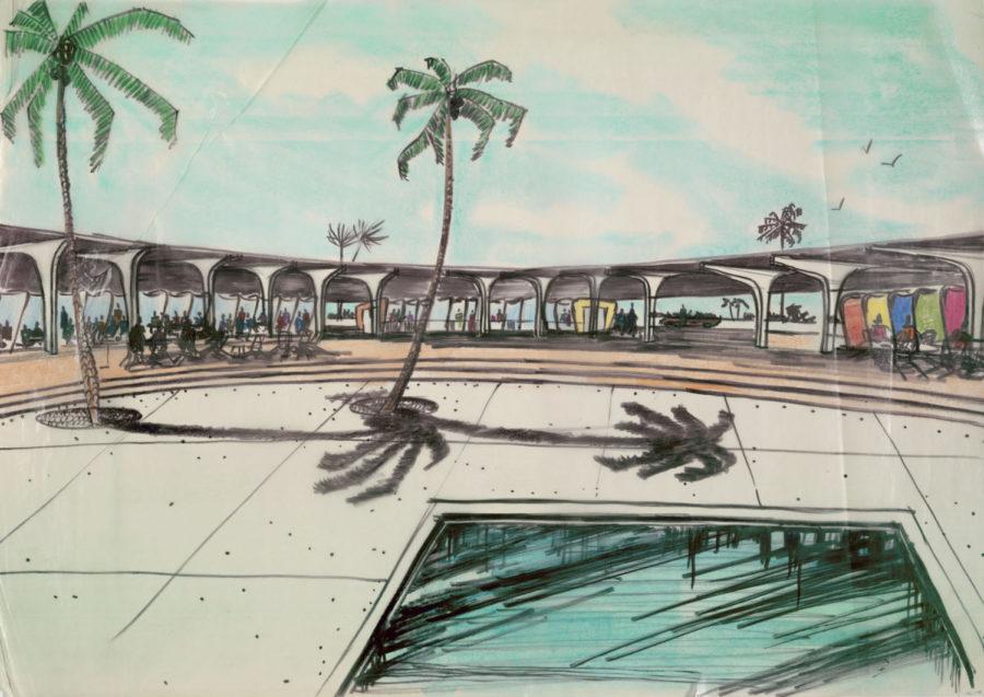
This community-minded design was present in much of Goldberg’s work—sometimes a little too much. Goldberg’s first design for River City was of nine clusters of three 72-story buildings. These would house over 20 thousand people, and would have a post office, schools, and basic shops. His intention was to create close-knit communities in Chicago and a “walk-to-work” culture. From sketches and the detailed description of his plans for the communities, it occurred to me that what he was really trying to create were condensed, miniature suburbs. This River City never came to fruition and Goldberg settled for a serpentine group of curved apartment buildings that are now housed just south of the Loop. The model of this, the white, snake-like structure set against an aqua representation of the river, looks like a tacky, Caribbean resort.
The exhibit also features examples of Goldberg’s other artistic work, namely, his drawings and furniture designs. His sketches, “Study of Circles,” “Study of Bottles,” “Study of Male Nude,” and other such “studies,” look very art student–esque. Even the best of the drawings, “Servant of Two Masters Costume Design,” which comically depicts a large man with a small head and thick black glasses wearing a fat, oval penguin suit, is hardly notable compared to Goldberg’s other work. His furniture is more interesting, though similarly amateurish. A clunky, Lucite-topped coffee table has legs made of bicycles spokes. Another table looks like a giant white dinner plate, with a slightly hollowed center, and a large, plush chair has, puzzlingly, only one arm.
If there’s one thing to take away from the exhibit, it’s the great variety in Goldberg’s work. Initially, he worked in manufacturing and designed freight cars, sketches of which are on display. He designed a bathroom that would simplify plumbing and decrease the cost of construction, but it was never widely adopted because it conflicted with deep-seated building codes and trade practices. At one point he obsessed over the idea of mobility, designing the “Mobile Penicillin Lab” and “Mobile Delousing Unit”, among others, none of which were ever built. His plans for the “Mobile Delousing Station African Theater” are on display at the exhibit.
While many of Goldberg’s sketches and designs may only interest architects or Goldberg fanatics, the exhibit, with its plethora of information, is smartly designed to entice the rest of us, too. However, even this dazzling show cannot save an amateur architect critic from noticing the often unsophisticated nature of the work.


