The MFA thesis exhibition Beautiful Snail is a contemporary display dedicated to showcasing the talents of graduate students based in the visual arts majors at the University of Chicago. The exhibit opened to the public on May 6 and will be on display at the Reva and David Logan Center for the Arts until June 12.
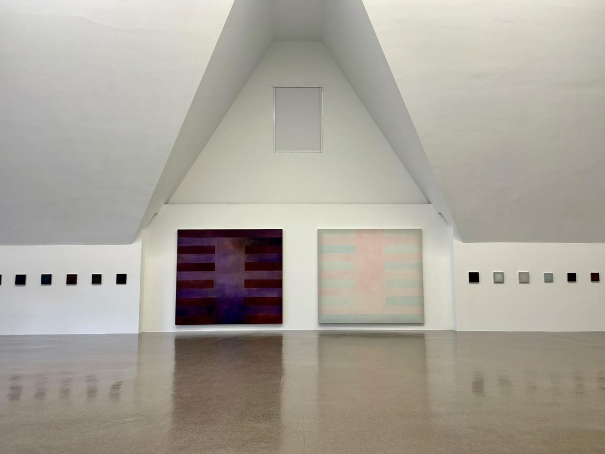
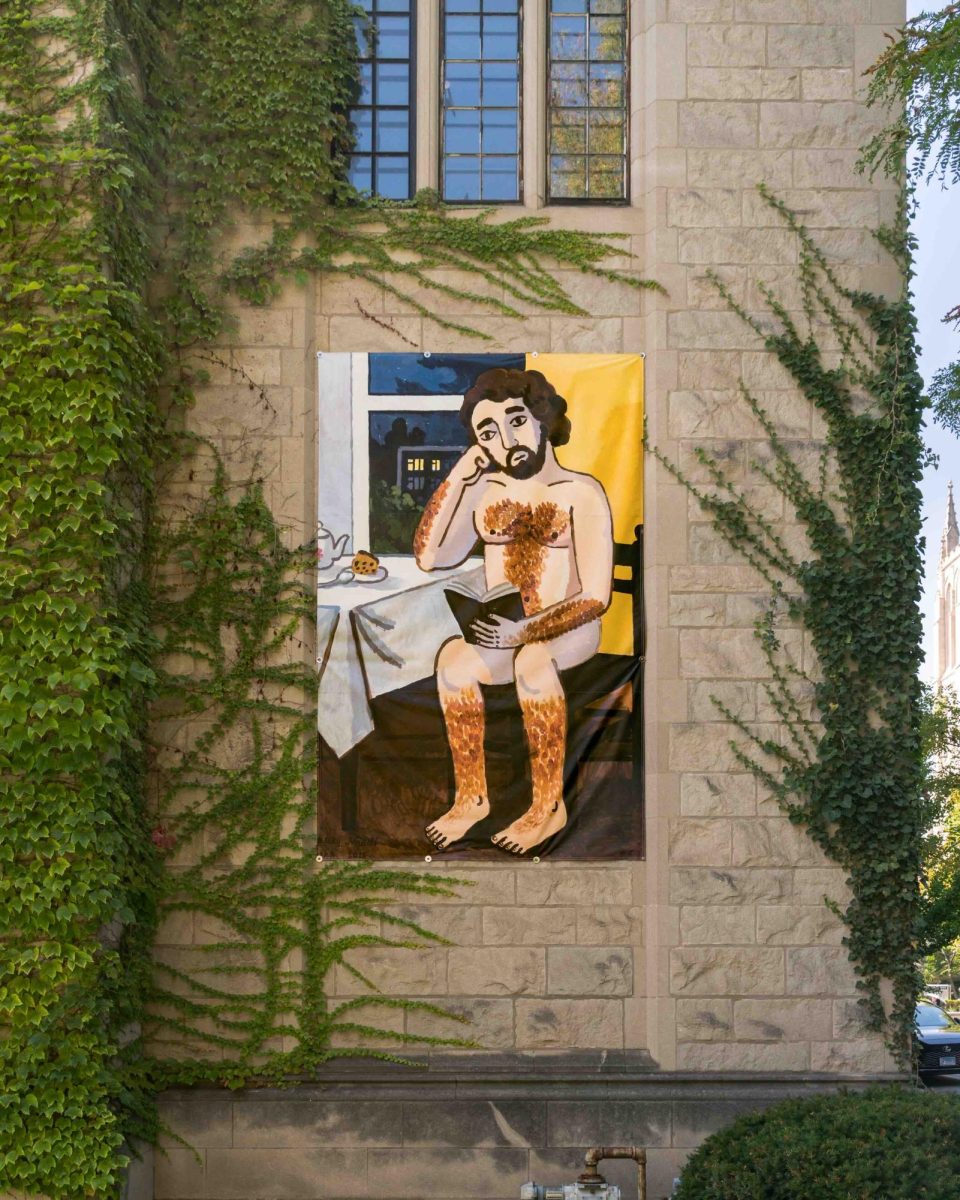
Walking into Beautiful Snail, I found myself moving between three separate rooms, each with a number of displays. The art pieces are not labeled by name or creator, making it hard to know how to refer to each piece. It was not entirely clear where each piece ended and where another began. I also would have liked to know the name of each artist in relation to their portion of the exhibit and some context about each piece. The main room was the most unique and held several of the exhibition's most complex pieces; one that comes to mind is a large electronic display of screens. A main screen plays videos of unnamed famous people saying “this is contemporary” over and over again. Next to the screen, images of people are projected on the wall. Their mouths are open and connected by wires that lead to a tub of hotdogs on the floor. At this point in the exhibition, the viewer starts to feel confused and overwhelmed by the sheer amount of material used in this piece. From the projections to the hot dogs to several other aspects of the piece, it is hard to pick one part of the exhibition to stare at. It seems as if the piece plays on the idea that confusion and the contemporary go hand in hand. Alongside this, an illuminated table standing in a pile of black sand caught my eye. This second piece was isolated and lonely. I could not get close to the table, and for that reason I felt uninvolved and excluded from the message of the piece. The darkness of the sand itself seemed to seep out to the onlooker, making me establish visually that I myself was being infected with this darkness.
My general issue with the contemporary exhibit was a lack of labeling, which led me to question whether Beautiful Snail was meant to be one large collaborative exhibit, or if each section was a separate art piece made by a different artist with a unique message. If the exhibition was meant to be one grand collaboration between all the graduate students, then why were some separated into different rooms, and why were others in the same room? I was not entirely sure if pieces worked in concert or were meant to stand on their own, and if they did work in concert, I would have liked to know the theme. It would have helped as a viewer to know the name of the artist, piece, and each artist’s process of working with their medium and creating their final project.
Though there was some confusion when it came to the curation of the exhibition, I found myself immersed in the artwork, although confused by the messages and the purpose of each piece. If you are keen to see some innovative contemporary art, head to the Logan Center to look at the MFA Thesis Exhibition.


