
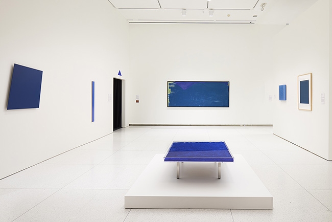
Avery Preesman’s diptych “Echo”: On the left, lines of micro wax run with Cartesian precision across a large canvas panel, and the whole piece is painted a single flat sterling. On the right, a much smaller square of concrete has been debossed with a sort of rough crosshatching. Deep grooves radiate from one corner of the piece, and Preesman has stamped the letter P four times in a diagonal procession. Looking back at the first canvas, you can discover those same grooves and stamps, fashioned with an exactitude that lets them fade back into the other lines of micro wax.
“Echo,” currently on display in the Smart Museum of Art’s Monochrome Multitudes installation, revels in an understatement that suffuses many of its exhibition neighbors. There are few recognizable symbols and no apparent narrative. The curators for Multitudes write that the exhibit “opens up this seemingly reductive art to reveal its global resonance and creative possibilities.” But what becomes obvious wandering through the exhibit is that the “reductive” quality of monochrome art allows for a deeper engagement with the ideas of form, texture, and medium as dominant modes of artistic expression—a diversity of color being inalienable from most people’s idea of what constitutes, at the very least, a painting. In other words, it’s the reductive quality of monochrome art that makes it compelling, unique, and worth considering as a genre with its own merits.
In “Echo,” color serves as a proxy for form and medium rather than a quality with any sort of symbolic value. The mathematical canvas is painted gray to mimic the sculptural work. Since paint, micro wax, and canvas are more amenable to exact human control than a slurry of concrete, there is a sense in which the canvas seeks to perfect and, through perfecting, erase the more primitive sculpture. The work seems to ask, “Who needs the imperfect when the perfect is within grasp?” It is this use of color that puts the two halves of the diptych into conversation with each other. “The monochrome” links the painted canvas and the concrete sculpture. It creates a kind of self-reflexivity.
We can find a similar relationship between the monochrome and form and medium in Kwon Young-woo’s untitled Dansaekhwa, also exhibited in Multitudes. In the “painting,” Kwon forgoes the brush and ink of traditional Korean calligraphy and experiments with manipulating the paper itself. The untitled work is simple: a large, square sheet of paper with eighteen gentle tears shaped like brushstrokes across the center. Their effect is an impression that the medium, the form, and the artistic process are all one and the same; there’s no distance between them. The form (the tears) is also the medium (the canvas) and the artistic process (the brushstroke). Again, it’s the absence of color that enables this understanding. Form, medium, and artistic process would suddenly spring back apart with the introduction of color.
The power of works like those by Kwon and Preesman rests in their self-reflexivity, their desire to collapse the classical distinctions present in most art. The works ask: Is it possible, or even reasonable, for us to consider medium, form, and artistic process as separable? To what degree is art dependent on itself for its own existence or meaning? Our lives are full of similar impossible little distinctions. Social media is nothing if not self-reflexive—it references itself constantly as new trends emerge out of dying trends. It confesses its own failings to preempt real counteraction; how often do we see Instagram posts criticizing the tyranny of, say, beauty trends that the app has itself created? Classical distinctions about society implode. We are both the watcher and the watched, creator and consumer. Both our contemporary society and Kwon and Preesman’s works reflect Jean Baudrillard’s maxim, “No more subject, no more focal point, no more center or periphery: pure flexion or circular inflexion,” from his 1981 book Simulacra and Simulation. The reductive power of the monochrome, collapsing form and medium and process in the absence of color, alludes to just how self-reflexive our world can be.
Sometimes, Monochrome Multitudes seems to forget that it is interested specifically in the monochrome rather than in works generally concerned with color. Blue-chip artists like Ellsworth Kelly and Alexander Calder sneak into the exhibit despite the fact that their works are rendered, plainly and pointedly, in a diversity of colors. Kelly’s work, for example, is a set of five differently colored squares—hardly monochrome! There’s something ironic about the fact that artists whose work can be discovered in any major American city have been squeezed into an exhibit where they don’t belong. Is it just so their names can be plastered on advertisements? Wouldn’t the chance to discover or rediscover some unsyndicated artist be a stronger appeal for the museumgoer?
But the presence of Kelly and Calder indicates a lack of focus in the exhibit that moves beyond the purely superficial. Kelly and Calder are asking entirely different questions about art. Unlike Kwon and Preesman, they don’t want to collapse the classical distinctions of art; they want to explore their extremes. They want to widen the distance between form, color, and medium. By presenting works embracing such distance—a series of colored squares or a mobile fashioned in black, red, yellow, and white—Kelly and Calder interrogate whether color itself can have meaning or value in itself. This strikes me as a question that can only be asked when colors are placed into conversation with one another. Only then can “color” really exist. When we throw out cheap color symbolism—black is the color of death, green the color of envy, and other such nonsense—and take a good look at a work of monochrome art, there is really no such thing as color. The color simply is. All we can evaluate are form, texture, and medium.
It’s the freedom to focus purely on form, texture, and medium that allow for the self-reflexivity of Kwon and Preesman. For Kwon, the brushstrokes and the paper are the work of art. For Preesman, art is locked in a struggle of iteration and erasure, the precise at war with the primitive. There is a collapse of ideas, of meaning and form and medium, in these works. Kelly and Calder still depend on a kind of abstraction, the separation of colors from each other and from medium and form. Their work hearkens back to a cultural moment of more obvious distinctions in our daily lives, in which we were the watchers of television, the consumers of cultural trends. In Kelly and Calder, the classical distinctions of art, of some antique social moment, remain. The power of the monochrome goes untapped.